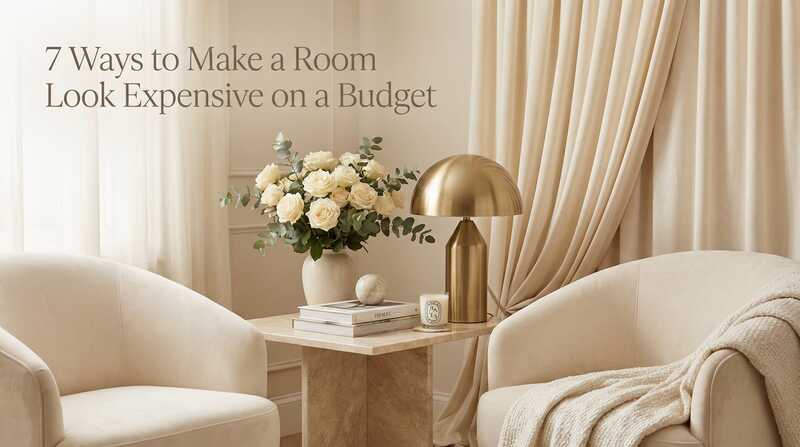
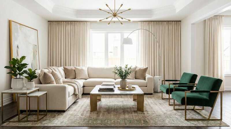
7 Ways to Make a Room Look Expensive on a Budget
Designer secrets for creating high-end looks without the high-end price tag.
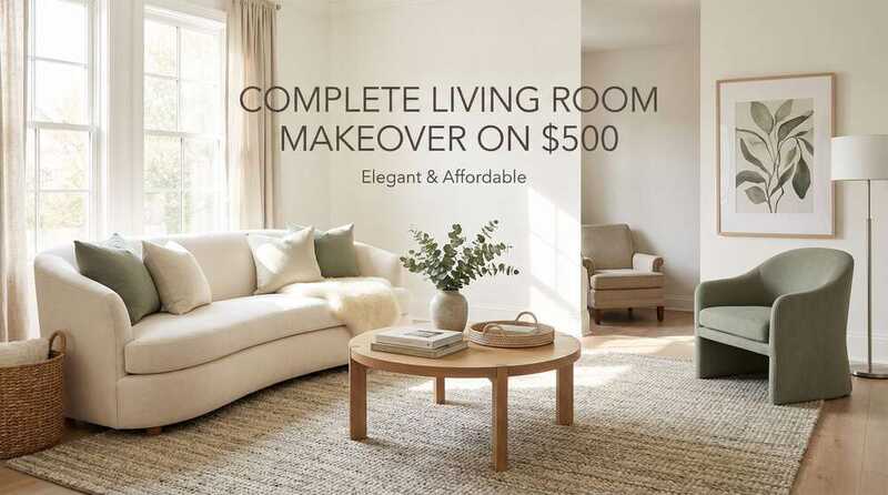
Complete Living Room Makeover on $500
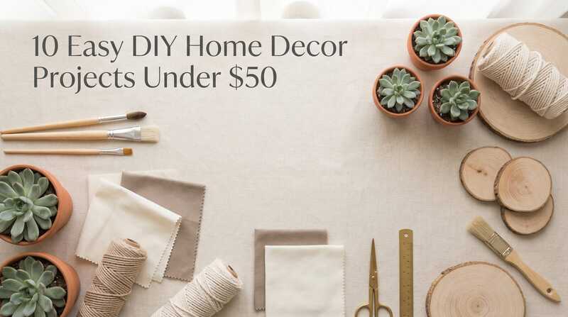
10 Easy DIY Home Decor Projects Under $50
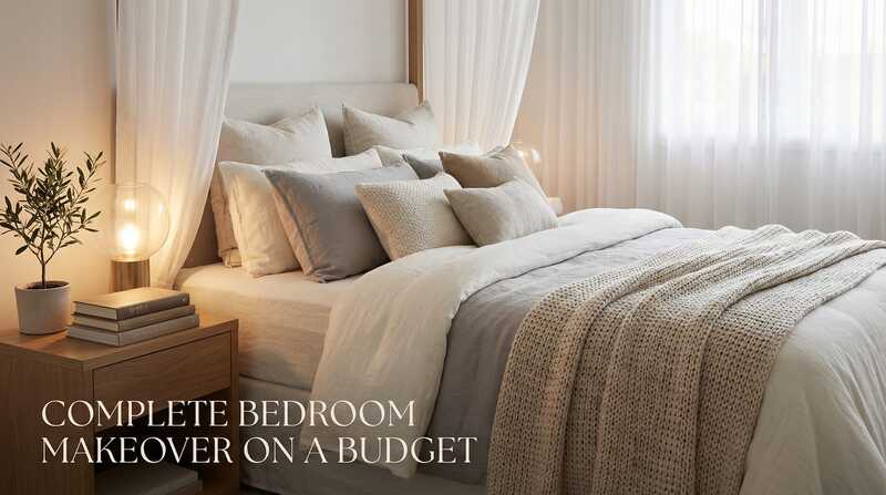
Complete Bedroom Makeover on a Budget: Transform Your Space for Under $800
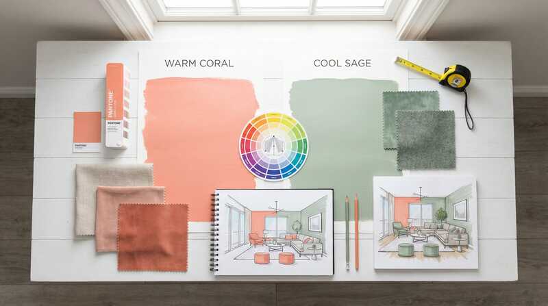
The Psychology of Color in Budget Decorating
Start Exploring
Popular Buying Guides
Curated product recommendations to help you shop smarter and create beautiful spaces on any budget.
Best Area Rugs for Living Rooms
Find the perfect rug size and style for your space, organized by budget.
Best Bedroom Blackout Curtains
Style meets function with these top-rated blackout curtains for better sleep.
Best Floor Lamps for Small Spaces
Maximize light without taking up precious floor space in compact rooms.
Best Throw Pillows That Look Expensive
Elevate your sofa or bed with these budget-friendly designer-look pillows.

Best Peel-and-Stick Wallpaper
Renter-friendly wallpaper options that transform your space without damage.
Best Kitchen Organization Tools
Smart storage solutions that keep your kitchen functional and beautiful.
Latest from the Blog
Fresh ideas, practical tips, and inspiration for every room in your home.
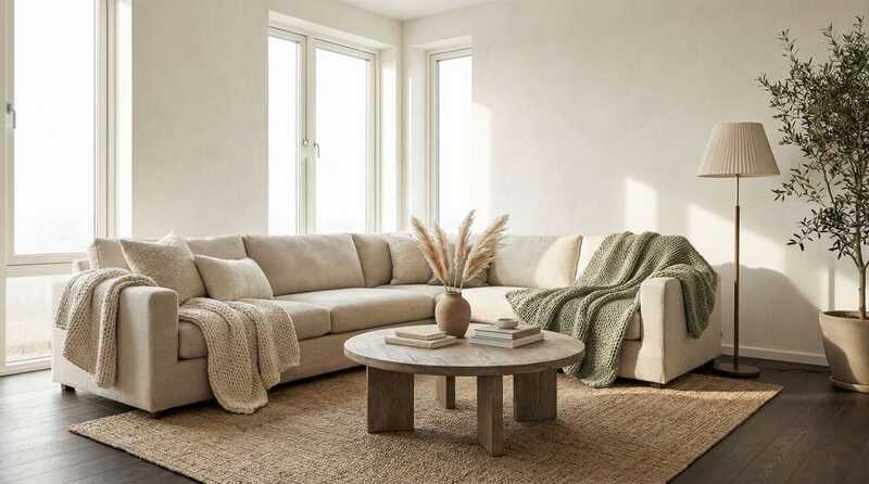
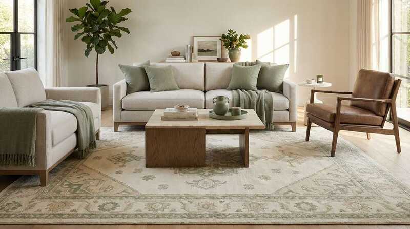
Million Dollar Living Area Decor Look for Less
Achieve the luxurious, high-end aesthetic of million-dollar homes without the designer price tag.
7 Ways to Make a Room Look Expensive on a Budget
Designer secrets for creating high-end looks without the high-end price tag.
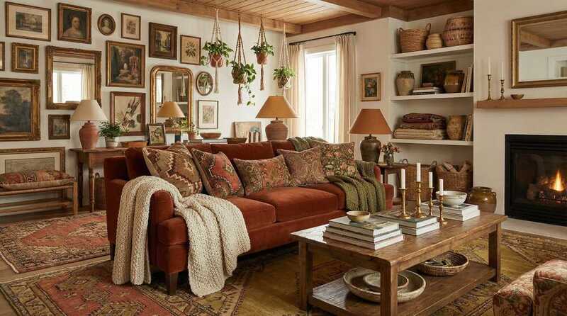
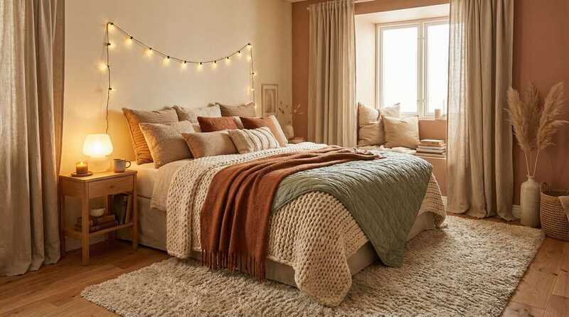
Cozy Maximalist Living Room on a Budget
Embrace the 'more is more' trend with warm, personality-filled spaces.
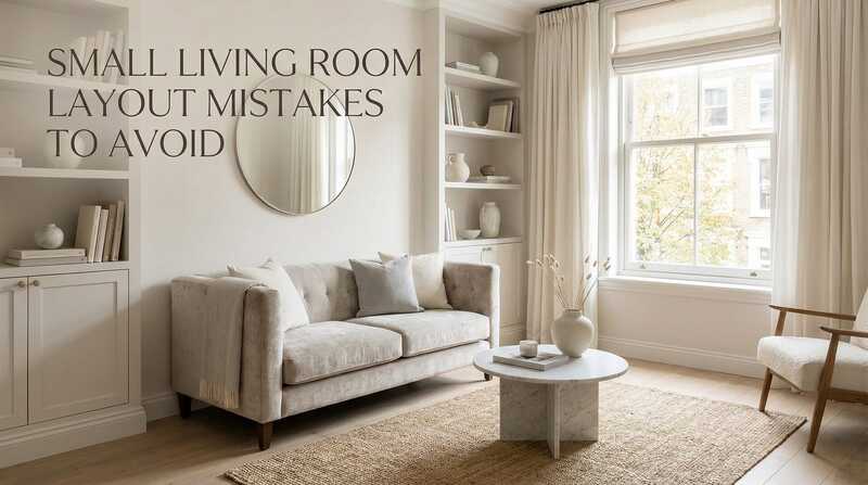
Small Living Room Layout Mistakes to Avoid
Common furniture arrangement errors that make small rooms feel cramped and how to fix them.
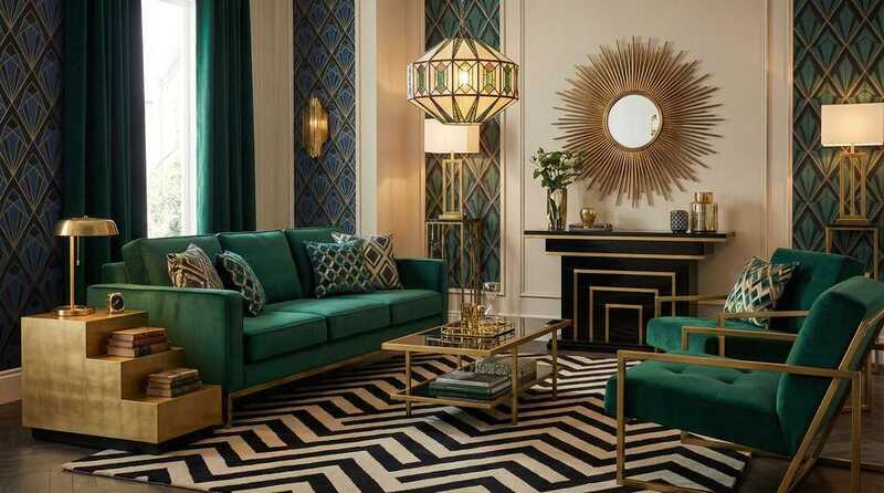
Neo Deco on a Budget
Bring the glamour of Art Deco into your home without breaking the bank.
Complete Bedroom Makeover on a Budget
Transform your space for under $800 with strategic planning and smart shopping.
Get Your Free Room Refresh Checklist
Join our community and receive a comprehensive checklist to transform any room in your home—plus weekly design tips and exclusive buying guides.
Why Trust Love Budget Decor?
Real Experience
We test and research products ourselves, focusing on what actually works in real homes.
Budget-Conscious
Every recommendation considers value, durability, and style—because beautiful shouldn't mean expensive.
Practical Advice
No design jargon or unattainable looks—just honest, actionable tips you can use today.