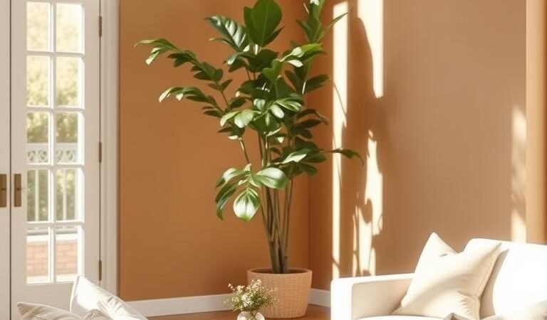
Creating a sophisticated home atmosphere starts with the right design choices. A well-balanced neutral color palette offers versatility, warmth, and elegance—perfect for any interior. Unlike stark whites or flat grays, modern neutrals include soft earthy tones, muted blues, and warm beiges that add depth.
Experts like Havenly designer Toussaint Derby craft visually engaging schemes that avoid coldness. By blending textures and subtle contrasts, these palettes create a curated yet inviting space. They also highlight architectural details while allowing easy seasonal updates.
Whether refreshing a room or starting from scratch, a color palette of understated hues ensures lasting appeal. Discover how to layer these tones for a harmonious and adaptable design.
Key Takeaways
- Modern neutrals go beyond basic whites and grays.
- Texture and contrast add warmth to minimalist spaces.
- Neutral backdrops highlight architectural features.
- Earthy tones and soft blues create depth.
- Versatile palettes allow easy seasonal updates.
Why Neutral Color Palettes Never Go Out of Style
Effortless elegance begins with a foundation of adaptable hues. Unlike bold contrasts, these understated schemes evolve with trends—much like the “little black dress of interior design,” as Meg & Co notes. The secret? Curation. As Havenly designers emphasize, thoughtful layering prevents spaces from feeling cold or unfinished.

The Versatility of Whites, Beiges, and Grays
Warm whites and mushroom grays seamlessly bridge styles. Pair them with reclaimed wood for a modern farmhouse or sleek metals for an urban loft. These shades like Piktochart’s “Calm Neutrals” (#F5F5F5 to #A0A0A0) craft professional yet inviting environments.
| Shade | Best Paired With | Effect |
|---|---|---|
| Oatmeal | Exposed brick | Highlights texture |
| Honeyed oak | Olive upholstery | Earthy versatility |
| Putty | Brass accents | Understated luxury |
How Neutrals Enhance Architectural Details
Subtle tones spotlight craftsmanship. Crown molding pops against oatmeal walls, while sisal rugs add tactile depth without competing for attention. For more inspiration, explore how warm whites and mushroom grays adapt to diverse aesthetics.
Creating a Serene and Sophisticated Atmosphere
Beige-and-ivory schemes reduce visual clutter, fostering mindfulness. Linen drapes and walnut finishes introduce warmth, proving neutral palettes excel at crafting calm. The result? A space that feels curated—never overwhelming.
9 Expert-Approved Neutral Color Combinations
Transform any space with these curated, designer-favorite schemes. Each blend balances warmth, contrast, and texture—proving that subtlety speaks volumes. From high-contrast classics to earthy harmonies, these palettes adapt to any style.

1. Classic High-Contrast: Black, White, and Ivory
Havenly’s formula uses 70% ivory walls as a canvas. Add 20% tan furniture and 10% black fixtures for drama. The result? A crisp, gallery-like backdrop that highlights art and architecture.
2. Warm-Toned Traditional: Rusty Brown and Cognac
Meg & Co pairs cognac leather chairs with exposed brick. Matte black shelves ground the look, creating a library-worthy vibe. Earthy yet elegant, this combo ages beautifully.
3. Scandi Minimalist: Cool Grays and Chocolate Brown
Dove-gray walls let chocolate velvet throws shine. Add 64 plants (yes, really) for organic contrast. The blend feels cozy, not sterile—minimalism with soul.
4. Down to Earth: Olive Green and Honeyed Oak
Olive sectionals prevent honeyed floors from skewing rustic. Linen pillows and a jute rug add touch of texture. Nature-inspired, but polished.
5. Neutral Navy: Layered with Whites and Wood Tones
Navy artwork pops against cloud-white walls. Pair with driftwood consoles for coastal charm. The deep blue anchor keeps the space serene, not nautical.
6. Plum Pops: Subtle Burgundy Accents
Havenly’s *”5% rule”* suggests burgundy in small doses—think dried peonies in clay vases. Removable and refined, these accents won’t overwhelm.
7. Natural Warmth: Walnut, Brass, and Tan
Brushed brass lamps glow against walnut tables. Polished nickel works too, but brass adds retro flair. The mix feels lived-in and luxe.
8. Soft Sands: Tranquil Beach-Inspired Hues
Piktochart’s palette (#E4D6C7 to #8B7B6A) mimics shorelines. Seagrass baskets and washed linen complete the vibe—relaxed, not themed.
9. Misty Grays: Calm and Professional
Pair bleached oak desks with misty-gray walls for home offices. The color palette fosters focus without feeling cold. A hint of warmth in every shade.
Pro Tips for Layering Neutral Colors Like a Designer
Mastering the art of layering neutrals elevates any space from ordinary to extraordinary. The key is balancing tones, textures, and subtle contrasts—techniques that designers swear by. Here’s how to create depth and personality without overwhelming the sense of calm.

Balance Light and Dark Neutrals for Depth
Use the 60-30-10 rule: 60% light base (walls), 30% mid-tone furniture, and 10% bold accents. A slate sofa with charcoal pillows adds drama, while ivory walls keep it airy. Test paint samples at different times—gray undertones shift with daylight.
Incorporate Texture for Tactile Interest
Piktochart’s strategy combines wool throws, linen curtains, and cotton cushions. Try a braided jute rug under a nubby wool throw. Hammered bronze bowls or travertine side tables introduce earthy textures.
Add Subtle Pops with Accessories
Havenly suggests removable accents like burgundy peonies in clay vases. Follow the “three-tier” method: permanent (art), semi-permanent (pillows), and temporary (fresh greens). This keeps spaces adaptable.
Use Patterns Sparingly
A herringbone pillow on a solid sofa adds interest without chaos. Meg & Co’s stone fireplace pairs with sheepskin for soft contrast. Stick to tonal patterns—charcoal on slate—for cohesion.
- Lighting matters: Layer recessed lights, paper lanterns, and brass sconces.
- Finish play: Matte and glossy grays side by side create dimension.
- Test before committing: Swatch fabrics and paints in your space.
Conclusion
Spaces infused with warmth and balance stand the test of time. A cozy atmosphere begins with adaptable hues—like Piktochart’s “Timeless Tones” palette—layered with textures that evolve seasonally.
For personalized spaces, Havenly’s style quiz tailors neutrals to your taste. Meg & Co proves how structural integrity shines when paired with earthy beiges and soft contrasts.
Experiment freely with the nine combinations, but always anchor them with tactile depth. As the Sage archetype reminds us: *”True timeless elegance comes from intentional layering.”*