A well-designed space feels inviting—almost like a warm embrace. The secret? It’s all about blending color schemes and textures to craft visual harmony. Whether you’re refreshing a cozy bedroom or revamping a lively living room, the right combinations can transform any area into a sanctuary.
Great design isn’t just about looks—it’s about how a room makes you feel. Soft fabrics, smooth finishes, and bold hues work together to create an emotional connection. The interplay of light and material can turn a plain space into a dynamic retreat.
This guide explores how to pair shades and surfaces for maximum impact. From modern minimalism to rustic charm, these principles adapt to any aesthetic. Ready to unlock the potential of your home? Let’s dive in.
Key Takeaways
- Combining colors and textures enhances visual and emotional appeal.
- Different rooms benefit from tailored design approaches.
- Balance technical rules with personal style for a unique look.
- Lighting and materials influence the overall mood of a space.
- Universal design principles work across various decor styles.
Understanding Color Theory and the Color Wheel
The magic of great design starts with mastering the language of hues. The color wheel is your roadmap—a tool artists and designers have relied on for centuries. Sir Isaac Newton’s circular diagram reveals how shades interact, creating endless harmonious combinations.

Primary, Secondary, and Tertiary Colors
Primary shades—red, yellow, blue—anchor every palette. Mix them, and you get secondary hues: vibrant orange, lush green, regal purple. Tertiary colors bridge the gaps, like red-orange or blue-green, offering subtlety and depth.
Warm vs. Cool Tones
Imagine fiery reds energizing a room—or serene blues melting stress away. Warm tones (reds, oranges) excite, while cool hues (blues, greens) soothe. Balance them to control a space’s mood.
The Role of Hue, Value, and Saturation
Think of hue as a color’s name (like “crimson”), value as its lightness, and saturation as its intensity. A deep navy (high value, low saturation) feels moody; a pastel pink (low value, high saturation) whispers softness.
Lighting changes everything. A velvet couch might look plum under lamplight but eggplant in sunlight—this is metamerism. Test swatches in your space before committing.
Types of Color Schemes for Interior Design
From bold contrasts to serene blends, color schemes shape a home’s personality. Each palette tells a story—whether through monochromatic depth or triadic energy. Here’s how to harness their power.

Monochromatic: Simplicity and Depth
A single hue, like Benjamin Moore’s Hale Navy, creates sophistication through gradients. Pair velvety navy walls with lighter throw pillows and charcoal accents. Avoid flatness by mixing textures—think linen drapes against a glossy side table.
Complementary: Bold Contrasts
Opposites on the wheel ignite drama. Farrow & Ball’s fiery Charlotte’s Locks pops against Inchyra Blue cabinetry. Pro tip: Use this combo sparingly in small spaces to prevent overwhelm.
Analogous: Harmonious Blends
Neighboring tones, like Sherwin-Williams’ coastal trio (Rainwashed, Sky High, Quietude), whisper serenity. Ideal for bedrooms or sunrooms seeking fluidity.
Triadic: Vibrant Balance
Three hues spaced evenly on the wheel (e.g., Behr’s Coral Clay, Spring Fern, Breezy) offer playful energy. Stick to the 60-30-10 ratio: 60% dominant, 30% secondary, 10% accent.
Neutral: Timeless Versatility
PPG’s Shagreen and Creamy Mushroom base pairs effortlessly with bolder touches. For inspiration, explore this classic blue and beige combo—a failproof foundation.
The Power of Texture in Design
Texture transforms rooms from flat to fascinating—adding layers that invite touch and intrigue the eye. Beyond color schemes, surfaces create mood and movement. A nubby throw or sleek marble countertop tells its own story, turning a space into a sensory experience.

Defining Texture: Visual vs. Tactile
Visual texture tricks the eye. Grasscloth wallpaper mimics woven reeds, while printed tiles imitate weathered wood. Tactile textures, like chunky knit blankets or rough-hewn beams, demand physical interaction.
Balance both types for depth. A glossy ceramic vase on a matte table plays with light, while a faux-fur rug adds softness without overwhelming patterns.
Natural Materials for Organic Warmth
Wood, stone, and metals bring earthy elegance. Reclaimed oak beams pair with polished nickel fixtures for rustic-meets-modern flair. Stone accent walls ground smooth leather sofas, creating contrast.
Metals like brass or iron introduce reflective elements. Use them sparingly—a hammered copper pendant light or iron shelf brackets add interest without clutter.
Mixing Rough and Smooth Surfaces
Opposing textures create harmony. Try a honed marble countertop with rough open shelving, or a velvet sofa against exposed brick. The key is proportion:
| Rough Texture | Smooth Pairing | Room Application |
|---|---|---|
| Jute rug | Glass coffee table | Living room |
| Stone backsplash | High-gloss cabinets | Kitchen |
| Basketweave bedding | Satin pillowcases | Bedroom |
Pro tip: In small spaces, limit large-scale patterns. Opt for subtle variations—like a linen-look wallpaper with a silky duvet.
How to Combine Color Schemes & Textures Effectively
Great design thrives on balance—the perfect mix of bold shades and tactile elements creates rooms that feel alive. Whether you prefer subtle neutrals or dramatic contrasts, these strategies help craft spaces with depth and personality.

Neutral Bases with Pops of Color
Start with a calm foundation. Clare Paint’s Whipped walls offer a creamy backdrop for vibrant accents like Golden Hour throw pillows. This palette keeps the room fresh yet grounded.
Place bold combinations strategically—a statement wall near the entryway or colorful artwork above a neutral sofa. For more inspiration, explore these expert-approved color pairings.
Bold Colors with Subtle Textures
Deep hues shine when paired with understated materials. Farrow & Ball’s Brinjal makes a dramatic statement, while linen curtains soften the look. The key? Let one element dominate.
Metals add interest without clutter. Try brushed brass drawer pulls against matte black cabinets or iron lamp bases beside velvet chairs.
Layering Textures for Dimension
Build tactile depth step by step. Start with smooth hardwood floors, add a jute rug, then top with a nubby wool throw. This progression feels natural and inviting.
Follow this simple formula for contrast:
| Surface Type | Texture Example | Pairing Suggestion |
|---|---|---|
| Smooth | Glass tabletop | Woven placemats |
| Rough | Exposed brick | Silk curtains |
| Soft | Chenille sofa | Metallic side table |
Lighting enhances texture play. Directional spotlights cast shadows across woven baskets, while soft ambient glow highlights plush fabrics. Every layer tells its own story.
Room-by-Room Application
Every space in your home serves a unique purpose—and deserves its own design approach. By tailoring shades and textures to each room, you create environments that feel both cohesive and intentional. Here’s how to apply these principles where they matter most.

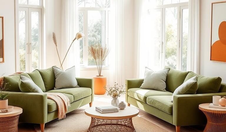
Living Rooms: Warm Tones + Plush Textures
Social hubs thrive on inviting energy. Sherwin-Williams’ Rookwood Red pairs beautifully with shearling chairs—creating a cozy yet sophisticated vibe. Layer in woven wool throws and a nubby area rug for tactile contrast.
For smaller spaces, try muted terracotta walls with velvet cushions. The warmth makes gatherings feel intimate, while soft fabrics encourage relaxation. Balance bold elements with neutral wood tones to avoid overwhelming the design.
Bedrooms: Cool Palettes + Soft Layers
Retreats demand serenity. Benjamin Moore’s Palladian Blue walls set a tranquil stage when paired with Matouk linen bedding. Add depth with a chunky knit blanket and silk-edged throw pillows.
Pastel accents—like those in this spring refresh guide—enhance the calm. Think misty aqua blackout shades or lavender-hued artwork. The goal? A sanctuary that melts stress away.
Kitchens: Neutral Backdrops + Metallic Accents
High-traffic areas need practicality with polish. Alabaster-painted cabinets gain elegance from Emtek brass pulls. Pair with honed quartz countertops and a hammered copper pendant light for refined contrast.
Open shelving displays smooth ceramic dishes beside rough wooden bowls—a play of textures that feels organic. For backsplashes, consider pebble tiles or glossy subway tiles to reflect light beautifully.
| Room | Color Strategy | Texture Pairing |
|---|---|---|
| Entryway | Hale Navy console | Seagrass runner |
| Bathroom | Sea Salt walls | Pebble shower floor |
| Home Office | Urbane Bronze accent | Walnut desk |
Sunrooms and nurseries follow similar rules. Wicker furniture in Autumn Blaze pops against striped cushions, while cloud-patterned shades soften nursery light. Every choice should serve both style and comfort.
Conclusion: Crafting Your Unique Aesthetic
Your home should reflect the poetry of your daily life—every corner a verse of comfort. Great design thrives on balance, but rules matter less than the joy your space brings. Start small: an accent wall in Hale Navy or a heirloom quilt draped over a modern sofa.
Keep a material sample kit—fabric swatches, paint chips—to maintain harmony. Swap textures seasonally: breezy linens for summer, chunky wools for winter. Removable wallpaper lets you experiment without commitment.
Seek inspiration everywhere. Local spots like Slate Contemporary Gallery offer fresh perspectives. Remember, your space should whisper your story. Pro tip: Photograph rooms in natural light to see elements as they truly live.