Few color schemes stand the test of time like monochrome palettes. The bold contrast between dark and light creates striking, adaptable spaces that feel both modern and enduring. Whether in minimalist lofts or cozy farmhouses, this approach blends sophistication with versatility.
High-contrast design taps into psychology, balancing energy and calm. Geometric patterns, matte finishes, and metallic accents add depth. From Art Deco’s glamour to Scandinavian simplicity, this palette adapts effortlessly to any aesthetic.
Strategic material pairings—like marble with wrought iron—elevate the look. Play with textures and scale to keep the space dynamic. The result? A home that feels curated, not chaotic.
Key Takeaways
- Monochrome palettes offer timeless flexibility across design styles.
- Contrast creates visual interest while maintaining harmony.
- Texture and pattern prevent flatness in neutral spaces.
- Metallic or natural wood accents warm up the scheme.
- Adaptable for both modern and traditional interiors.
The Timeless Allure of Classic Black and White Decor
The interplay of dark and light creates timeless elegance. Crisp whites and velvety blacks form a canvas that adapts to any era. This duo amplifies architectural details—think vaulted ceilings framed by bold moldings or open shelving against matte walls.

Rooted in the 1920s Art Deco movement, the palette stands the test of time. Speakeasy floors with checkerboard tiles mirrored the era’s rebellion. Today, modern lofts embrace the same contrast for a sleek edge.
Designer Abby Pendergrast praises its neutral flexibility: “A monochrome base lets you evolve decor without overhauling foundations.” Swap art, textiles, or furniture while the backdrop remains cohesive.
| Era | Signature Use | Modern Adaptation |
|---|---|---|
| 1920s | Geometric floors, lacquered furniture | Hexagon tiles, high-gloss cabinets |
| 2020s | Minimalist contrasts | Mixed metals, organic textures |
Contrast defines spaces without color distractions. A black fireplace surround draws focus, while white walls expand small rooms. The result? A layered aesthetic that feels intentional, not overwhelming.
For those hesitant, start small. A striped rug or graphic artwork introduces the dynamic. Over years, these accents can grow into full-room statements.
Historical Roots: From Art Deco to Modern Day
Checkerboard tiles and angular motifs first electrified interiors a century ago—and still inspire today. The 1920s Art Deco movement birthed this high-contrast aesthetic, where geometric floors and lacquered furniture defined luxury. Speakeasies and hotels embraced the drama, pairing crisp whites with velvety blacks for unmatched sophistication.

The 1920s Art Deco Influence
Original Art Deco clubs featured zigzag patterns and sunburst mirrors. These elements mirrored the era’s rebellion—think bold chevron floors and chrome accents. Designers like Émile-Jacques Ruhlmann turned monochrome into a status symbol, using ebony and ivory for timeless appeal.
By the 1950s, atomic-era furniture adopted sharper angles. Mid-century modern designers swapped gloss for matte, blending function with contrast. The look evolved but kept its foundational drama.
Evolution in Contemporary Interiors
Postmodern design trends reinterpreted these ideas in the 1980s. Black-framed Crittall doors and graphic murals revived the palette. Today, preserved tilework in historic renovations bridges past and present.
- Original features: Sunburst mirrors, stepped moldings.
- Modern twists: Mixed metals, organic textures.
- Preservation: Restored checkerboard floors in brownstones.
From Art Deco’s glamour to today’s minimalist lofts, this contrast remains a cornerstone of interior design. Its adaptability proves some trends truly stand the test of time.
Why Black and White Works in Every Room
Rooms gain instant character when anchored by monochrome contrast. This palette adapts to any function—energetic for social hubs, calming for private retreats. The key lies in balancing light and dark to suit the space’s purpose.

Living Rooms: Bold and Balanced
In living rooms, pair a sculptural black sofa with a ivory shag rug for tactile contrast. Add a reclaimed wood coffee table to ground the space. Designers often use charcoal area rugs to soften high-contrast floors.
Lighting plays a pivotal role. A matte black pendant lamp over a white marble side table creates drama. For evenings, warm the room with brass floor lamps—their glow offsets cool tones.
Bedrooms: Serene and Sophisticated
Bedrooms feel instantly serene with matte black bed frames and crisp white linens. Layer in grey mid-tones through throw pillows or a chunky knit blanket. This softens the contrast while keeping the palette cohesive.
For smaller spaces, try a white wall with black-framed mirrors. They reflect light and add depth. Nightstands in natural wood warm the monochrome scheme without disrupting harmony.
| Room | Key Strategy | Materials |
|---|---|---|
| Living Room | High-contrast seating + textured rugs | Velvet, marble, mixed metals |
| Bedroom | Soft layers + reflective surfaces | Linen, oak, brushed nickel |
Transitional decor bridges the contrast. A black-and-white striped ottoman or geometric artwork ties spaces together. The result? A home that feels curated, not confined by its palette.
Mastering the Color Ratio
Mastering color proportions ensures a polished, intentional look. Designers rely on three foundational formulas—70/30, 50/50, and 90/10—to create balance. Each ratio serves a unique purpose, from amplifying spaciousness to grounding a room.

A 70% white base expands small spaces, reflecting light for an airy feel. Use 30% black for focal points, like a statement sofa or framed artwork. This split keeps the palette fresh, not overwhelming.
For equal impact, the 50/50 ratio demands precision. Try black lower cabinets with white countertops or a checkerboard floor. Designer Lena Wells notes, “Black window mullions against white walls add architecture drama without closing in the space.”
Bold personalities might prefer 90% black with 10% white accents—think matte walls with crisp trim. This high-contrast design works in lofts or moody libraries. Avoid “zebra stripe” effects by clustering dark elements strategically.
- 70/30: Ideal for small rooms; white dominates, black anchors.
- 50/50: Balanced symmetry; best for kitchens or entryways.
- 90/10: Dramatic and intimate; suits modern styles.
This palette continues to stand test of trends. Pair with neutral tones like oak or linen to soften contrasts. The result? A timeless space that feels curated, not chaotic.
Materials That Elevate the Monochrome Palette
Natural elements soften high-contrast designs with organic warmth. The right materials add depth, ensuring spaces feel curated, not cold. From reclaimed wood beams to gleaming marble countertops, these choices define the aesthetic while enhancing longevity.

Natural Wood for Warmth
Walnut’s rich grain contrasts beautifully with pale ash finishes, adding visual interest. Reclaimed oak beams paired with limewash walls create texture without overwhelming the palette. For smaller touches, try oil-rubbed bronze hardware—its patina complements wood tones.
Designers favor sustainable options like bamboo or FSC-certified oak. These natural materials ground modern spaces with earthy warmth. A live-edge coffee table or woven rattan chair balances sleek monochrome lines.
Marble and Stone for Luxury
Calacatta gold marble waterfall islands become instant focal points. For family homes, durable quartz mimics marble’s veining without high maintenance. Pair stone surfaces with matte black fixtures for modern edge.
Textured travertine backsplashes or honed granite floors add subtle variation. These materials ensure longevity while elevating the aesthetic. As designer Elena Petrov notes, “Stone anchors the palette, letting you play with bold patterns elsewhere.”
Textiles and Patterns to Layer In
Textures and patterns breathe life into monochrome spaces, adding depth and movement. Fabrics soften stark contrasts, while prints introduce rhythm—transforming flat palettes into dynamic interiors. The key lies in balancing scale and tactile appeal.
Stripes and Geometrics
Stripes anchor rooms with timeless structure. Vertical lines elongate ceilings, while horizontal ones widen narrow halls. For modern styles, try tonal stripe rugs layered over solid floors—subtle yet impactful.
Geometric patterns create visual rhythm. Schumacher’s houndstooth upholstery or hexagonal throw pillows nod to Art Deco. Pair bold prints with matte solids to avoid clutter. Designer Nina Freemont advises, “Scale matters—oversized motifs overwhelm small rooms.”
Linen and Velvet for Texture
Linen’s relaxed drape tempers formal contrasts. Slipcovered sofas in ivory linen feel approachable, while blackout drapery with sheer white underlayers balances light control and airiness.
Velvet’s plush embrace adds luxury. A charcoal Chesterfield with herringbone wool throws merges durability and warmth. For cohesion, match velvet accent chairs to metallic finishes—brass legs echo gilded frames elsewhere.
| Fabric | Best Use | Pairing Tip |
|---|---|---|
| Linen | Casual slipcovers, curtains | Layer with jute rugs for earthy contrast |
| Velvet | Statement furniture, pillows | Mix with matte metals for modern edge |
These design trends prove that even neutral palettes thrive with thoughtful layering. Whether embracing a bold trend or sticking to classics, textiles ensure spaces feel curated—not cold.
Architectural Details That Make a Difference
Thoughtful trim work and structural elements elevate monochrome spaces from simple to striking. These features add depth, framing rooms with intention. Whether in a historic brownstone or modern loft, these touches create visual rhythm.

Crown Molding and Wainscoting
Proportional sizing matters. For 8-foot ceilings, opt for 3-5 inch crown molding—anything wider feels heavy. Picture frame paneling in entries adds vintage charm without overwhelming the space. Fluted wood accents on monochrome walls create subtle texture.
Cost-effective PVC alternatives mimic traditional plaster details. Designer Marco Santos notes, “Modern materials offer durability while preserving historic character.” Pair with matte black door casings for crisp definition.
Arched Doorways for Softness
Curves soften monochrome’s sharp contrasts. Rounded drywall returns on archways balance angular furniture. For contemporary homes, pair arched openings with geometric tile floors—the mix feels intentional, not chaotic.
Coffered ceilings add grandeur to open-concept spaces. Paint the recessed panels black for drama, keeping beams white. This technique draws the eye upward, making rooms feel taller.
| Detail | Impact | Best Placement |
|---|---|---|
| Crown Molding | Defines ceiling lines | Living rooms, dining areas |
| Wainscoting | Protects walls + adds texture | Entries, hallways |
| Arched Doorways | Softens transitions | Between public/private spaces |
Built-in storage maximizes function while maintaining clean lines. Floor-to-ceiling shelving in matte black provides display space without clutter. The result? A home where every architectural detail serves both beauty and purpose.
Checkerboard Floors: A Bold Classic
No flooring pattern commands attention like bold black-and-white squares. These iconic floors have anchored spaces from Parisian cafés to Brooklyn brownstones, proving their ability to stand the test of time. Whether in marble or porcelain, the look balances tradition with contemporary edge.

Traditional marble tiles offer unmatched luxury but require sealing. Modern porcelain mimics the veining of natural stone with lower maintenance—ideal for high-traffic kitchens. Diagonal layouts amplify movement, while grid patterns suit minimalist design.
Grout color dramatically alters the effect. Charcoal lines intensify contrast; pale gray softens it. For a seamless look, match grout to tile edges. In historic homes, original black-and-white checkerboard floors often feature slim, velvety grout lines.
| Material | Best For | Care Tip |
|---|---|---|
| Marble | Formal entries, low-traffic areas | Reseal annually |
| Porcelain | Kitchens, mudrooms | Use pH-neutral cleaners |
Jonathan Adler’s checkerboard rugs reinterpret the trend for flexible styling. Layer them over hardwood or tile for temporary drama. Their wool blend withstands foot traffic while adding graphic punch.
To keep floors pristine, sweep daily and damp-mop weekly. Avoid vinegar or abrasive pads—they dull finishes. With proper care, these patterns never go out of style, offering endless versatility.
Adding Pops of Color (When You Want To)
Even the most striking monochrome spaces benefit from strategic color accents. A single bold hue or earthy tone can elevate the decor without disrupting harmony. The key? Restraint and intentional placement.

Farrow & Ball’s *Hague Blue* makes a sophisticated statement as an accent wall. Its deep, moody tone contrasts elegantly with white trim, anchoring the room’s energy. For smaller doses, citrus-yellow throw pillows pop against a charcoal bed frame—a nod to seasonal trends.
Greenery bridges nature and design. A fiddle leaf fig in a woven planter softens sharp lines, while eucalyptus stems in black vases add organic texture. These transitional touches keep the space feeling alive.
Framed abstract art serves as a focal point. A crimson brushstroke on a white canvas or a terracotta-hued lithograph introduces warmth. Limit accents to 20% of the room to maintain the palette’s integrity.
Avoid oversaturating the base scheme. Earthy paint tones like olive or rust work best in matte finishes, while glossy brights (think emerald or fuchsia) demand careful balancing. The result? A space that feels cohesive yet fresh—proof that even timeless style welcomes thoughtful reinvention.
Mixing Metals for Depth
Metallic finishes add dimension to monochrome spaces, creating layers of visual interest. When paired thoughtfully, brass, nickel, and matte black interact like a symphony—each note enhancing the others. This design strategy ensures contrast feels curated, not chaotic.

Brass and Matte Black: A Timeless Pair
Polished nickel sconces against iron curtain rods exemplify intentional contrast. Unlacquered brass faucets develop a velvety patina over years, adding organic warmth. For subtle cohesion, match matte black switch plates with bronze cabinet handles.
Restoration Hardware’s mixed-metal chandeliers demonstrate how finishes can stand the test of trends. Their aged brass arms paired with gunmetal chains create depth without overwhelming the space.
Finish Hierarchy Strategies
Anchor the room with one dominant metal (e.g., matte black for fixtures), then layer secondary finishes. Gleaming nickel towel bars pop against charcoal walls, while brushed bronze drawer pulls add understated luxury.
- Primary: Matte black for structural elements (lighting, hardware).
- Secondary: Brass or nickel for decorative accents (mirror frames, shelf brackets).
- Tertiary: Mixed textures (hammered copper bowls, wire-brushed oak).
Unlike fleeting trends, this approach evolves gracefully. Natural materials like brass develop character, ensuring spaces feel lived-in yet polished.
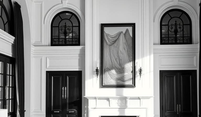
Art and Mirrors in Monochrome Spaces
Strategic art and mirror placement transforms monochrome interiors into dynamic galleries. These elements define a space’s rhythm, balancing light and shadow while adding personality. From gilded frames to floor mirrors, each piece serves both form and function.
Gilded Frames for Elegance
Antique gold-leaf frames infuse warmth into high-contrast interiors. Their reflective surfaces catch ambient light, softening stark black-and-white backdrops. Designers often anchor rooms with a single oversized gilded mirror—its patina deepening over years for organic character.
For a polished look, pair ornate frames with matte black canvases or vintage etchings. The 2/3 wall rule ensures proportionality: artwork should span two-thirds of the wall’s width. Thrift stores and estate sales offer affordable finds, like convex mirrors with mercury-glass finishes.
Oversized Mirrors for Light
Floor-to-ceiling mirrors amplify natural light, especially in narrow hallways or north-facing rooms. Position them opposite windows to double sunlit garden views. Blackened steel frames modernize the home, while beveled edges nod to Art Deco glamour.
UV-protective glass preserves art in sun-drenched spaces. For layered depth, lean a full-length mirror against a textured wall or layer it behind a sculptural console. The result? A timeless interplay of reflection and shadow.
Discover more timeless design tips to refine your monochrome palette.
Small-Space Strategies
Urban dwellers can transform compact rooms through strategic material choices and scale. Glossy white ceiling paint reflects ambient light, making low ceilings appear taller—especially effective in studio apartments. For cohesion, continue the sheen on trim work while keeping walls matte.
Nested black acrylic side tables save space while adding modern edge. Their transparent bases maintain visual airflow, unlike bulky alternatives. Layer with metallic trays for reflective surfaces that amplify light.
Full-height drapery installation tricks the eye upward. Mount rods inches below the ceiling with panels kissing the floor. This vertical emphasis balances the horizontal lines of open floor plans, a favorite in micro-lofts.
- Expandable dining solutions: Drop-leaf tables with enamel tops serve as desks or dinner settings
- Pattern scale matters: 4″ stripes widen narrow halls; oversized florals shrink bathrooms
- Multifunctional pivots: Storage ottomans with lift tops conceal blankets
In galley kitchens, high-gloss cabinets bounce light between parallel walls. Pair with open shelving to maintain the illusion of depth. The result? A design that feels intentional, not cramped.
Sustainable and Timeless: Choosing Quality Over Trends
True design longevity comes from materials that age gracefully, not fleeting fads. Pieces crafted from solid walnut or handwoven wool stand the test of time, developing richer character with each passing year. Fast furniture may cost less upfront but often needs replacement within five seasons.
Vermont Woods Studios exemplifies ethical sourcing, using FSC-certified oak and non-toxic finishes. Their dining tables withstand decades of family meals, while mass-produced alternatives warp under daily use. You’ll cherish the velvety patina that forms on responsibly harvested wood.
When selecting textiles, prioritize these certifications:
- GOTS (Global Organic Texture Standard) for chemical-free dyes
- GoodWeave for ethically produced rugs
- Cradle to Cradle for recyclable natural materials
| Furniture Type | Average Lifespan | Cost Per Year |
|---|---|---|
| Fast furniture | 3-5 years | $120 |
| Heirloom quality | 30+ years | $25 |
Local artisans like Brooklyn’s Ironwood Metalworks create custom iron beds that last generations. Their collaborative process ensures pieces fit your space perfectly—unlike disposable flat-pack alternatives. Restoration specialists can often revive vintage finds for half the cost of new items.
This approach transforms your home into a curated collection of meaningful pieces. Each scratch and worn edge tells a story, proving that sustainability and beauty need not compete.
Conclusion: Designing a Home That Endures
Monochrome interiors offer more than visual appeal—they create spaces that evolve gracefully through years come. By balancing contrast with quality materials, these designs become lifelong backdrops for personal stories.
Start small with a signature piece: a marble console or geometric rug. Layer in textures like linen and aged brass for warmth. Over time, these elements develop character, proving timeless design isn’t about perfection—it’s about authenticity.
Consider how each choice might age. Will that blackened steel lamp patina beautifully? Can the wool upholstery withstand decades? This intentional approach transforms rooms into legacies.
Ready to begin? Focus on three pillars:
• Contrast harmony – 70/30 ratios for flow
• Material integrity – Natural woods, durable stone
• Personal accents – Art that sparks joy
Your home should reflect who you are—and who you’ll become. With this foundation, every addition feels purposeful, ensuring your space never style feels dated.