Transforming a room with layered patterns and contrasting textures adds depth and personality. Imagine wooden floorboards paired with a floral rug or velvet cushions resting on a linen sofa—each combination tells a unique story. This technique elevates interior design from ordinary to extraordinary.
Balancing bold prints with subtle textures creates a tactile experience that engages the senses. A well-curated space blends different scales—like large geometric wallpaper with petite polka-dot throw pillows—to achieve visual harmony. The 60-30-10 rule helps maintain proportion while allowing creativity to shine.
Whether designing a cozy home or a vibrant living area, mixing elements builds emotional connections. For inspiration, explore this comprehensive guide to pattern play. Both maximalists and minimalists can craft spaces that reflect their unique style.
Key Takeaways
- Layering patterns creates depth and character in any room
- Texture combinations like velvet and linen enhance tactile appeal
- The 60-30-10 rule ensures balanced visual proportions
- Varying pattern scales prevents overwhelming the space
- Neutral bases anchor bold designs for cohesive results
Understanding Patterns and Textures: The Foundation of Design
Great design begins with mastering the language of patterns and textures. These elements transform blank canvases into dynamic spaces, weaving stories through visual and tactile contrasts. Whether subtle or bold, their interplay defines a room’s character.

Types of Patterns
Patterns breathe life into interior design, each type evoking distinct moods:
- Whimsical florals: Delicate blooms add softness, perfect for cozy bedrooms.
- Structured geometrics: Sharp lines create modern energy in living areas.
- Classic stripes: Timeless and versatile, they anchor eclectic spaces.
Even wood grains count as natural patterns—their organic lines add visual interest to floors or furniture. Remember, architectural details like herringbone tiles contribute to “pattern math,” blending built-in designs with decor.
How Textures Add Depth and Tactile Interest
Texture engages touch and sight, turning flat surfaces into sensory experiences. Pairing opposites—like nubby wools with smooth marbles—creates depth interest space. For example, matte linen curtains soften the boldness of graphic wallpaper.
| Texture Type | Effect | Best Pairings |
|---|---|---|
| Nubby Wool | Warmth and comfort | Glossy ceramics |
| Smooth Marble | Elegant contrast | Textured knit throws |
| Woven Jute | Earthiness | Silk cushions |
Scale matters too. A large damask rug balances petite micro-checks on pillows, proving patterns different scales harmonize effortlessly. For more ideas, explore this affordable living room decor guide to experiment with layers.
How to Mix Patterns and Textures Harmoniously: Key Principles
A room sings when patterns and textures collaborate thoughtfully. The secret lies in strategic layering—blending bold statements with subtle anchors to create cohesive look that feels intentional, not chaotic.

Start with a Neutral Base for Cohesion
Ground the space with calm foundations. Beige walls and an oatmeal rug provide a blank canvas, letting vibrant accents shine. This approach ensures balance, preventing visual overload.
Vary Scales: Pair Large and Small Patterns
Contrast is key. An oversized botanical print above a pinstripe chair creates rhythm. Remember:
- Large-scale designs (wallpaper, area rugs) anchor the room
- Medium prints (drapery, upholstery) build mid-layer interest
- Small motifs (throw pillows, ceramics) add delicate punctuation
Use the 60-30-10 Rule for Balanced Layers
Divide elements proportionally:
- 60% solid neutrals (sofas, walls)
- 30% medium textures (woven blinds, linen lampshades)
- 10% bold statements (geometric pillows, ikat ottomans)
Test combinations by living with fabric swatches under morning and evening light. A rough-hewn wood table paired with glossy vases proves texture contrast elevates ordinary moments.
Color Coordination Strategies for Seamless Blending
Color transforms spaces like a painter’s brush—strategic coordination creates visual poetry. When hues collaborate intentionally, they help create rooms that feel both exciting and serene. This chromatic dance relies on three pillars: unified palettes, saturation harmony, and impactful accents.

Choosing a Unified Color Palette
Monochromatic schemes build sophistication through tonal variation. Imagine slate blue walls anchoring a navy herringbone rug, with powder blue throws adding depth interest. This approach ensures cohesion while allowing texture to shine.
For versatile foundations, consider these adaptable bases:
| Palette | CMYK Values | RGB Values | Best For |
|---|---|---|---|
| Warm Neutrals | 0-15-30-10 | 210-190-160 | Traditional spaces |
| Cool Grays | 20-15-15-0 | 180-185-190 | Modern aesthetics |
| Earthy Tones | 40-50-60-25 | 120-90-70 | Organic styles |
Matching Saturation Levels for Harmony
Colors sing when intensity aligns. Dusty rose paired with muted terracotta creates a whisper-soft look, while jewel tones demand equal vibrancy. Notice how lighting shifts perception—morning sun intensifies warm hues, while evening lamps deepen cool shades.
Accent Colors: Pops of Contrast Done Right
Mustard yellow trim on geometric pillows or glazed vase details inject energy without chaos. For bold balance, try complementary pairs like teal sofas with burnt orange cushions—separated by neutral buffers.
Remember undertones when mixing neutrals. Warm beiges clash with cool grays, disrupting the interior design flow. Test swatches under both natural and artificial light to ensure your style stays cohesive day and night.
Dos and Don’ts of Pattern and Texture Mixing
Design harmony emerges when bold choices meet disciplined restraint. Editing is the unsung hero of layered spaces—knowing which patterns together elevate a room versus overwhelm it. A meticulous approach ensures textures add visual interest without competing for attention.

Edit Ruthlessly and Test Swatches
Implement a 3-round elimination system:
- Round 1: Remove any print that clashes with your dominant hue.
- Round 2: Eliminate textures that feel redundant (e.g., two nubby fabrics).
- Round 3: Assess scale—keep only small, medium, and large contrasts.
Test swatches under morning and evening light. A floral that works well at noon might vanish in lamplight.
Don’t Overcrowd with Bold Prints
An animal print rug deserves solo spotlight—pair it with solids like a cream sofa. Overcrowding creates chaos, while curation builds balance harmony. For example, a single graphic wallpaper wall needs matte textures elsewhere.
Incorporate Solids as Visual Rest Spaces
A smooth leather armchair amid floral drapes gives eyes a place to rest. Follow the 60-75% coverage rule: neutral bases should dominate, letting patterns shine. Like affordable art display tips, spacing prevents sensory overload.
Room-by-Room Application: Tailoring Your Approach
From lively living rooms to serene bedrooms, texture play shifts with purpose. Each space demands unique combinations that add depth while serving functional needs. Whether creating a vibrant gathering area or a restful retreat, intentional layers make all the difference.

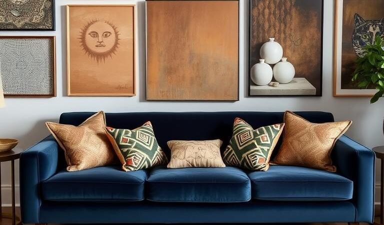
Living Room: Bold Statements with Subtle Anchors
This high-traffic room thrives on contrast. A herringbone wood floor grounds graphic area rugs, while velvet solids create cohesive look amid patterned throw pillows. Consider these pairings:
- Glossy marble coffee tables with nubby wool throws
- Geometric wallpaper paired with linen-upholstered furniture
- Metallic accent lamps against matte leather sofas
Bedroom: Calming Layers for Relaxation
Softness reigns in this home sanctuary. Tone-on-tone stripe bedding works well together with nubby knit throws—add smooth satin pillows for contrast. Blackout drapes in heavyweight fabrics ensure restful darkness, while a plush rug invites barefoot mornings.
Kitchen: Functional Textures with Playful Accents
Durability meets delight in this hub. Subway tile backsplashes add depth behind marbled counters, while checkered dish towels bring whimsy. Open shelving displays textured ceramics, turning everyday items into interest space.
Extend this philosophy throughout your home:
- Bathroom: Pebble-textured shower floors + geometric print curtains
- Entryway: Striped runners + hammered metal bowls
- Home Office: Leather chairs + tweed waste bins
Conclusion: Elevate Your Space with Confidence
Your home becomes a canvas when patterns and textures dance together. Start small—pair a striped pillow with a floral throw. Gradually layer larger pieces as your design confidence grows.
Remember these mantras:
- Rotate seasonal textiles to keep interior harmony fresh
- Photograph combos in black-and-white to test contrast
- Let neutrals anchor bold statements for balance harmony
Test swatches like a pro—velvet whispers differently than linen breathes. For curated inspiration, explore Lola Earl’s pattern collections.
Your space tells your story. Which design marriage will you try first?