A calming neutral palette creates the perfect backdrop for bold, vibrant touches. This design approach balances serenity with energy—soft beiges, warm taupes, or crisp whites layered with eye-catching hues. The result? A space that feels both timeless and fresh.
Neutrals offer incredible flexibility. Swap out pillows, throws, or artwork to refresh the look seasonally without a full redesign. Designer William Abranowicz emphasizes texture in his book Contemporary Cream, proving that even subtle tones can feel dynamic.
Think deep brown sofas paired with ruby-red cushions or sleek black walls accented by golden-yellow art. Rugs, furniture, and decor pieces become statement-makers against understated backgrounds.
Key Takeaways
- Neutral bases allow easy seasonal updates with colorful accessories
- Textures add depth to simple color schemes
- Bold accents create focal points without overwhelming the space
- Mix warm and cool tones for balanced contrast
- Start with large neutral pieces, then layer in vibrant details
Introduction to Neutral Living Room Decor with Pops of Color
Think of muted tones as the quiet heroes of home design. They create a serene backdrop, letting vibrant accents take center stage. A crisp white sofa, for instance, makes gold throw pillows or a cobalt-blue vase pop instantly.

Psychologically, this balance works wonders. Neutrals promote calm, while bold hues energize. Designer Eva Bradley champions taupe for its adaptability—it pairs with everything from emerald green to burnt orange. Her taupe spectrum approach proves how one shade can transform a neutral space.
Follow the 60-30-10 rule for harmony: 60% neutrals (walls, large furniture), 30% secondary tones (rugs, curtains), and 10% vibrant accents (art, decor). This formula keeps design cohesive yet dynamic.
A white living room with gold mirrors and navy-blue throws exemplifies this. The neutrals ground the space, while metallic and jewel tones add drama. It’s effortless to refresh—swap the blue for coral in summer or deep red in winter.
Why Choose a Neutral Base for Your Living Room
Neutral foundations act like a blank canvas—ready to adapt to any style or season. They provide a timeless base that lets vibrant accents shine without clashing. As designer Ken Fulk demonstrated in his Sonoma estate, a 19th-century mantel paired with modern furniture feels cohesive against soft beige walls.

Neutrals excel at highlighting architectural features. Exposed beams, crown molding, or brickwork stand out against understated tones. Pantone’s Leatrice Eiseman notes even sage green can function as a neutral, blending seamlessly with earthy or bold palettes.
For renters, neutrals are a game-changer. They offer flexibility without permanent changes:
- Paint restrictions? Use neutral furniture and rugs.
- Swap throw pillows or art for seasonal refreshes.
- Landlord-friendly yet personalized.
| Warm Neutrals | Cool Neutrals |
|---|---|
| Beige, taupe, cream | Gray, white, slate |
| Pairs with reds, oranges | Complements blues, greens |
| Cozy, inviting vibe | Sleek, modern feel |
Whether you prefer warm or cool color schemes, neutrals ensure longevity. They’re the quiet backbone of a room that never goes out of style.
Selecting the Perfect Neutral Color Scheme
Charlap Hyman & Herrero’s California residence—with its olive walls and stainless-steel accents—proves neutrals are anything but boring. The right color scheme balances subtlety and impact, letting textures and tones shine.

Whites, Grays, and Beiges: Timeless Neutrals
Crisp whites reflect light, while velvety beiges add warmth. Designer Suzanne Rheinstein layers these shades with scenic wallpaper for depth. For a modern twist, try Ishka Designs’ circular motifs in dove gray.
Benjamin Moore’s Historical Colors line offers failsafe options, like White Dove or Revere Pewter. Pair matte walls with glossy trims—a trick from Office of Tangible Space—to amplify texture.
Warm vs. Cool Neutrals: Finding Your Style
Warm beiges (think: Accessible Beige) feel cozy with terracotta or mustard. Cool grays, like Stonington Gray, complement jewel tones. Lime wash finishes add earthy grit, bridging both styles.
Consider your lighting: north-facing rooms benefit from warm palettes, while south-facing spaces can handle cooler tones.
Neutral Living Room Decor with Pops of Color: Key Principles
Designer Redd Kaihoi proves neutrals gain power through intentional contrast. His maximalist spaces pair stone walls with brass accents—proof that quiet tones shine brightest when balanced with strategic vibrancy.

The 3:1 Ratio Rule
For harmonious spaces, allocate three parts neutral to one part color. This formula prevents overwhelm while creating clear focal points. Jeremiah Brent’s charcoal lounge demonstrates this—deep gray walls make burnt-orange chairs command attention without dominating.
| Element | Neutral Allocation | Color Allocation |
|---|---|---|
| Walls | 100% | 0% |
| Furniture | 70% | 30% (accent chairs) |
| Decor | 60% | 40% (art, vases) |
Material Magic
Nicole Hollis’ desert retreat shows how materials add depth. Sunbaked terracotta pots against limestone floors create textural interplay. Bronze catches light differently than matte ceramics—this variation keeps monotony at bay.
Color Zoning Techniques
Group vibrant elements intentionally. Alfredo Paredes’ Vermont retreat uses “color zones”:
- A single turquoise cabinet anchors one corner
- Rust-colored throws define seating areas
- Black-framed art creates visual pauses
This approach maintains balance—each hue feels deliberate rather than scattered. Like chapters in a book, color zones guide the eye through the space.
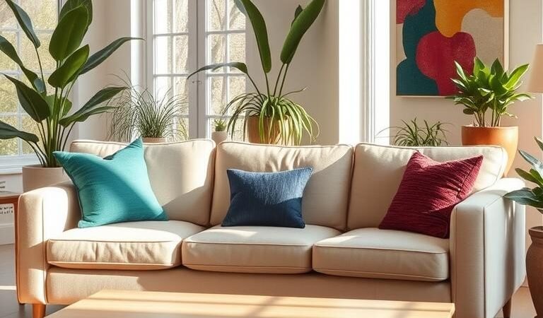
Throw Pillows: Easy and Versatile Color Accents
Throw pillows transform spaces instantly—like jewelry for your sofa. They’re the simplest way to inject style and refresh a room seasonally. Designer Cortney Novogratz champions 3-5 complementary hues, proving even small accents create big impact.

Mixing and Matching Pillow Colors
Think of pillows as a curated collection. The Rug Company’s feather prints pair beautifully with solid textures for winter, while Mosaique Bleue’s quilted blues shine in spring. For cohesion:
- Anchor with one large-scale pattern (global motifs).
- Add a geometric or stripe for contrast.
- Finish with a solid velvet or linen for balance.
Choosing Patterns and Textures
Palmito Design’s Moroccan-inspired pillows show how to mix boldly. Follow these guidelines for harmony:
| Element | Recommendation |
|---|---|
| Patterns per Sofa | 2-3 max |
| Texture Mix | Wool + silk + leather |
| Color Ratio | 60% neutral, 40% vibrant |
Etsy artisans offer washable covers—ideal for homes with kids or pets. Swap them monthly to keep your sofa looking fresh without commitment.
Artwork and Wall Decor for Bold Statements
Walls become storytellers when adorned with intentional decor. A single striking piece or a curated collection can transform a space from ordinary to extraordinary. The right artwork adds personality while maintaining balance in a neutral setting.

Creating a Gallery Wall
Gallery walls offer endless possibilities. Designer Bethany Nauert uses wood panels as focal points—their natural texture complements both large-scale art and intimate groupings. Follow these tips for a polished look:
- Scale matters: Mix oversized canvases with smaller framed pieces for visual rhythm
- Try salon-style arrangements—asymmetric clusters feel dynamic yet cohesive
- Use removable washi tape to test layouts before committing (perfect for renters)
Ellsworth Kelly’s bold geometric prints, like those in Winding Lane Design projects, prove how color-blocked art energizes neutral spaces. For budget-friendly options:
| Source | Style Range | Price Point |
|---|---|---|
| Minted | Contemporary prints | $$ |
| Saatchi Art | Emerging artists | $$$ |
| Local galleries | Unique originals | $$-$$$$ |
Selecting Vibrant Art Pieces
Lighting elevates artwork dramatically. Eric Schmitt’s directional fixtures cast gallery-worthy illumination—position them 30 inches above larger pieces. Consider these combinations:
- Abstract oils against linen-textured walls
- Black-and-white photography with one chromatic accent frame
- Textured fiber art in sunset hues above neutral sofas
Remember: art should spark joy. Whether it’s a thrifted find or investment piece, choose works that resonate personally while complementing your space’s color story.
Area Rugs: Grounding Your Space with Color
An area rug anchors a room like a stage for your furniture—letting colors dance against a neutral floor. Jennifer Morris of Third Source advises treating rugs as “colorful footprints” that define seating areas. Jute Bazaar’s kitchen designs prove even natural fibers can elevate tones when paired with geometric tiles.

Choosing the Right Rug Patterns
Vintage Kilim rugs from Istanbul markets bring heritage patterns into modern spaces. Their intricate motifs—think medallions and tribal stripes—add visual depth without overwhelming. For contemporary flair, try:
- Organic shapes: Free-form designs soften angular furniture
- Two-tone geometrics: Black-and-white checks pop against wood floors
- Ombré dyes: Gradient hues create subtle movement
Colorful Rugs for Neutral Floors
Roisin Lafferty’s projects showcase how emerald rugs mirror painted ceilings—a trick for cohesive drama. For hardwood protection, always use a non-slip pad. Size matters too:
| Room Size | Ideal Rug Dimensions |
|---|---|
| Small (10’x12′) | 6’x9′ with 18″ floor border |
| Large (15’x20′) | 9’x12′ with 24″ border |
Natural fibers like jute add earthy warmth, while synthetics (polypropylene) resist stains. Layer a bold dhurrie over sisal for texture contrast—a trick from Morris’ playbook.
Furniture as Statement Pieces
A single statement chair can shift an entire room’s energy from ordinary to extraordinary. Kingston Lafferty’s orange accent chair, showcased in Third Source, demonstrates how bold furniture becomes a focal point. These pieces blend artistry with function—think velvet sofas in emerald or sculptural acrylic chairs.
Vibrant Sofas and Chairs
Performance fabrics like Crypton or Sunbrella make colorful upholstery pet-friendly. Mario Bellini’s Camaleonda sofa, reissued by B&B Italia, pairs durability with modular style. For vintage finds, local upholstery services refresh thrifted treasures with custom hues.
- Eco-conscious picks: Sabai’s recycled velvet sectionals or Medley’s non-toxic finishes.
- Texture play: Bouclé armchairs against sleek leather sofas.
- Modular magic: Sectionals with reversible cushions for seasonal updates.
Unique Coffee Tables and Side Tables
Henryle Design’s nesting tables offer versatility—stacked for minimalism or spread for gatherings. Materials tell stories:
| Material | Effect |
|---|---|
| Reclaimed wood | Warmth + sustainability |
| Glass + brass | Light-reflecting glam |
For affordable luxury, marble-look laminate or painted metal mimics high-end designer pieces. Mix shapes—oval coffee tables soften angular rooms, while hexagonal side tables add edge.
Colorful Accents and Decor
Small decor pieces wield surprising power—transforming muted spaces into vibrant narratives. From hand-thrown vases to sculptural lamp bases, these details layer personality without overwhelming. Emily Brown’s drapery-pillow pairings prove cohesion starts with intentional accents.

Using Vases and Bowls
Jonathan Adler’s ceramic collections turn functional items into art. Try these strategies:
- DIY dip-dye: Submerge thrifted vases in diluted paint for ombré hues.
- Heirloom displays: Group colored glassware on open shelves for museum-like curation.
- Texture contrast: Matte stone bowls beside glossy lacquered trays.
| Vase Style | Best For |
|---|---|
| Hand-painted | Bohemian or eclectic decor |
| Geometric concrete | Modern minimalist spaces |
Livening Up with Lamps
Run For The Hills’ lighting designs blend function and drama. Key tips:
- Dimmer compatibility: Choose LED-compatible bases to adjust ambiance.
- Cluster lighting: Pair a bold floor lamp with petite table versions.
- Material mix: Brass bases with fabric shades soften industrial edges.
Curtains and Drapes for a Pop of Color
Turquoise valances in a white kitchen prove how small fabric choices make big statements. Window treatments blend function and artistry—filtering light while framing views with vibrant color. Designer Alyssa Kapito pairs plaster chandeliers with linen drapes, showing how textures elevate simplicity.

Choosing Bold Window Treatments
Linen drapes diffuse sunlight softly, while velvet blackouts create drama. Consider your home’s architectural style:
- Traverse rods: Ideal for heavy fabrics; glide smoothly for daily use.
- Blackout linings: Essential for bedrooms or media rooms.
- Plaster accents: Kapito’s trick—match drapery tones to ceiling details.
Combining Patterns and Solids
Striped curtains anchor floral sofas without chaos. Follow these ratios for balance:
| Curtain Length | Style Effect |
|---|---|
| Kiss (floor-grazing) | Clean, modern look |
| Puddle (extra fabric) | Luxurious, romantic vibe |
For a cohesive palette, pull hues from artwork or rugs. A pop of coral in drapes echoes throw pillows—tying the room together effortlessly.
Painted Accent Walls and Ceilings
A painted ceiling transforms a room’s atmosphere instantly—like a sky changing at dusk. Whether you choose a moody navy or a soft blush, overhead hues add depth and drama. Benjamin Moore’s jewel tones, like Hague Blue (HC-154) or Charged Green (SW-6929), turn surfaces into artistic statements.
Creating a Focal Point with Paint
Designer Rodney Lawrence’s sunrise-gradient walls prove paint can mimic nature’s magic. For a similar effect:
- Start with a base of First Light (2102-70) at the bottom.
- Blend upward into Golden Straw (2152-50).
- Finish with White Dove (OC-17) near the ceiling.
Tim Godbold’s trim contrasts—like matte black molding against eggshell walls—add architectural intrigue. Rent a sprayer for seamless finishes on textured surfaces.
Selecting Colors That Pop
Removable wallpaper offers commitment-free alternatives. Try Tempaper’s Botanical Garden peel-and-stick for a temporary focal point. For renters or indecisive decorators, it’s a game-changer.
Pair bold walls with neutral furniture to let the paint shine. A deep emerald accent wall feels balanced with a beige linen sofa and brass accents. Remember: test swatches at different times of day—lighting changes everything.
Cozying Up with Colorful Throw Blankets
Draping a vibrant throw over your sofa is like adding a sunset to a quiet landscape—instant warmth and drama. Jaipuri Razai quilts from First Source demonstrate this perfectly, their hand-blocked patterns layering color onto neutral furniture. These textiles balance artistry and function, offering both visual punch and physical comfort.
Mixing Textures and Hues
Lightweight linen throws breathe airy elegance into summer spaces, while chunky wool knits add winterweight texture. Nuno Nascimento’s projects showcase how emerald throws mirror painted walls—a trick for cohesive depth. Consider these fabric personalities:
| Material | Best For | Care Tip |
|---|---|---|
| Crinkled linen | Coastal or Scandinavian tones | Machine wash cold, hang dry |
| Cloud-like wool | Rustic or alpine themes | Professional dry clean |
Ethical brands like Coyuchi use organic dyes, while Boll & Branch’s fair-trade cotton supports artisan communities. Pet owners should opt for tightly woven fabrics—less tempting for claws than loose knits.
For storage, rolled throws in woven baskets preserve folds, while folded stacks on shelves create intentional displays. Rotate seasonally: pastel cotton for spring, spice-toned mohair for fall.
Indoor Plants: Natural Pops of Color
Greenery breathes life into neutral spaces—nature’s own vibrant brushstrokes. From snake plants’ sword-like leaves to fiddle-leaf figs’ broad canopies, plants add texture and movement. They’re living art, evolving with seasons and light.
Low-Maintenance Stars
ZZ plants thrive in dim corners, their waxy leaves reflecting light. Perfect for busy homeowners, they need water only every 2–3 weeks. Snake plants (Sansevieria) purify air—NASA studies show they remove benzene and formaldehyde.
- Self-watering pots: Ideal for travel; reservoirs prevent over/underwatering.
- Staghorn ferns: Mounted on wood slabs, they become wall sculptures.
- Fiddle-leaf figs: Rotate weekly for even growth; wipe leaves monthly.
Styling with Botanical Accents
Reese Witherspoon’s Ojai ranch mixes terracotta planters with cream walls—earthy yet elegant. Cluster varying heights: a tall dracaena behind a squat succulent trio. Use woven baskets to hide plastic nursery pots.
| Plant | Light Needs | Water Frequency |
|---|---|---|
| Snake Plant | Low to bright | 3 weeks |
| Fiddle-Leaf Fig | Bright indirect | 1 week |
| ZZ Plant | Low light | 2–3 weeks |
For design drama, pair a monstera’s split leaves with a minimalist white planter. Or let pothos vines trail from shelves—their heart-shaped leaves softening angular furniture. Plants prove even small color choices make lasting impact.
Understanding Color Psychology in Decor
Colors whisper emotions before a single word is spoken—they shape how we feel in a space. Pantone’s Color of the Year trends reveal how hues influence design choices globally. A well-curated color scheme does more than please the eye; it orchestrates moods, directs focus, and even affects circadian rhythms.
The Emotional Language of Hues
Leatrice Eiseman’s research categorizes colors into energizers (reds, oranges) and calmers (blues, greens). Sunlit yellows spark creativity—ideal for home offices. Velvety blues lower heart rates, perfect for bedrooms. Maureen Stevens’ lighting studies show warm tones at sunset help transition to evening relaxation.
Cultural meanings add layers. In Feng Shui, red signifies prosperity when used in entryways. Accessibility matters too—high-contrast palettes aid visibility for low-vision individuals.
Harmonious Pairings That Work
Complementary colors create dynamic balance. These fail-safe combinations suit any style:
| Base Color | Accent Pairing | Effect |
|---|---|---|
| Navy | Mustard | Sophisticated contrast |
| Sage | Terracotta | Earth-inspired warmth |
| Charcoal | Blush pink | Modern softness |
For timeless appeal, pull three tones from nature—like sand, sea foam, and coral. Test swatches at different times to see how light transforms them. The right palette doesn’t just decorate—it resonates.
Practical Tips for Maintaining Balance
Augusta Hoffman’s wood contrast techniques reveal how strategic layering creates visual equilibrium. In her Brooklyn loft, matte oak floors anchor glossy walnut shelves—proving texture variation sustains balance. This principle applies beyond materials to color distribution and spatial planning.
Quarterly Decor Audits
Seasonal shifts demand reassessment. Try this:
- Photograph your room from multiple angles—images reveal asymmetry the eye misses.
- Rotate 30% of accessories (swap summer linen pillows for autumn velvet).
- Re-evaluate traffic flow; furniture should “breathe” with 18-inch borders.
Fabric Balancing Act
David Netto’s folk-inspired design pairs rough burlap with delicate embroidery. Mirror this approach:
| Texture Pairing | Effect |
|---|---|
| Linen + leather | Casual elegance |
| Wool + silk | Tactile contrast |
Family-Friendly Materials
For households with kids or pets, prioritize:
- Crypton fabric sofas (stain-resistant yet soft)
- Rounded furniture edges (safety meets style)
- Washable rug pads (easy cleanup)
Budget wisely—allocate 60% to foundational neutrals, 30% to durable accents, and 10% to trendy experiments. This ensures spaces evolve without costly overhauls.
Remember: True harmony feels intuitive. When every piece has purpose and placement feels effortless, you’ve mastered neutral living at its finest.
Conclusion
Lily Dierkes’ scalloped ottoman proves small touches create big transformations. A living room with muted walls becomes dynamic with just one vibrant piece—whether it’s a cerulean throw or a mustard-yellow side table.
Experiment fearlessly. Try terracotta pots in sunlit corners or velvet cushions in emerald green. Share your creations with #ColorfulNeutrals for inspiration. Every home tells a story—let yours blend serenity with sparks of color.
For tailored advice, consult local color consultants or explore workshops at design centers like the Textile Arts Center. Your perfect palette awaits.