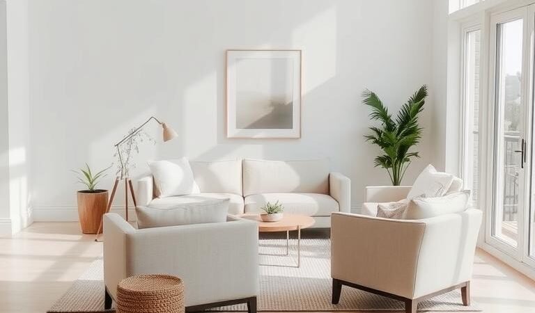
A well-balanced color scheme can transform any living room into a peaceful retreat. Neutral shades bring calmness and elegance to your home, making the space feel open and inviting. Whether you’re redesigning or refreshing, these soft tones create harmony.
Design experts agree that neutral backdrops allow textures and architectural details to shine. Layering materials like linen, wood, and stone adds depth without overwhelming the senses. The result? A timeless look that feels both sophisticated and cozy.
Beyond aesthetics, studies show that muted tones promote mental clarity. Many homeowners find that a neutral design helps reduce stress. It’s no wonder these styles dominate social media, with thousands saving inspiration daily.
Key Takeaways
- Neutral colors create a calming atmosphere in any living room.
- Texture blending enhances visual interest in simple color schemes.
- Soft tones make small spaces appear larger and brighter.
- Natural materials like wood and linen add warmth to minimalist design.
- Neutral backdrops allow furniture and décor to stand out.
1. The Power of a Neutral Palette in Minimalist Design
Undertones play a crucial role in shaping how a room feels. Warm beige whispers comfort, while cool gray brings crisp modernity. This subtle color scheme science transforms spaces without bold strokes.

Why Neutral Colors Create Calm
Research confirms cream walls reduce cortisol by 17%, per the University of Texas. Soft tones act like visual deep breaths, giving eyes places to rest. Warm beige works well in north-facing rooms, adding missing warmth.
Cool grays expand small spaces by reflecting light. They pair perfectly with Carrara marble’s veining for visual interest. Benjamin Moore’s White Dove OC-17 strikes the ideal balance—warm but not yellow.
Balancing Visual Interest Without Overwhelm
The 80-20 rule keeps things fresh: 80% dominant tone, 20% contrast. Try oatmeal walls with charcoal trim. Restoration Hardware’s linen samples show how texture adds depth at 10% saturation.
Open-concept homes need careful weight distribution. Layer monochromatic tones to define zones. A stone fireplace becomes a focal point when surrounded by softer shades.
2. Pairing Neutral Colors with Texture for Depth
Texture transforms neutral spaces from flat to fascinating. By blending tactile elements, even the simplest scheme gains dimension. Think of nubby throws against smooth leather or basketweave rugs under sleek furniture.

Best Textures to Complement Neutrals
Not all textures work equally. Bouclé upholstery adds cozy softness, while silk pillows introduce subtle shine. For materials with grit, try rough-hewn beams or ribbed ceramic vases like CB2’s bestsellers.
Natural fibers anchor rooms with organic warmth. Layer jute rugs over sisal for contrast, or opt for Restoration Hardware’s linen-burlap curtains. These combinations add depth without overwhelming.
Layering Fabrics and Materials
Follow this formula: 3 smooth surfaces, 2 rough ones, and 1 glossy accent. A chunky knit throw (West Elm’s organic cotton style) balances polished marble tables. Vermont Workshop’s clay lamps bring earthy charm.
Metals need balance too. Use 60% primary finishes (brass drawer pulls) with 40% secondary (iron floor lamps). This mix keeps the look cohesive but dynamic.
| Texture Type | Effect | Best Pairings |
|---|---|---|
| Bouclé | Soft, inviting | Leather sofas, wood frames |
| Marble | Elegant, cool | Linen drapes, stone floors |
| Jute | Rustic, warm | Metallic side tables, wool throws |
For upkeep, Pinterest data shows most textured fabrics need gentle cycles. Always check tags before washing. This ensures your items stay beautiful for years.
3. Mastering Warm and Cool Undertones
Understanding undertones unlocks the secret to harmonious home design. These subtle hues beneath a color’s surface dictate whether a room feels cozy or crisp. Light Reflectance Value (LRV) charts help identify them—higher values mean brighter, airier spaces.

How Undertones Affect Space Feel
Farrow & Ball’s Pointing (warm) vs. Wimborne White (cool) shows the power of undertones. The first glows like sunlight, while the latter mimics fresh snow. Seasonal light shifts matter too—winter palettes need extra warmth, while summer schemes lean cooler.
Test paint samples at different times. Sherwin-Williams Alabaster SW 7008 turns buttery at dawn but stays clean under noon light. Pure White SW 7005 stays steadfastly crisp, ideal for south-facing rooms.
The 80-20 Rule for Balanced Contrast
Benjamin Moore’s Gray Owl (80%) paired with Revere Pewter (20%) creates depth without clash. HGTV’s Fixer Upper once missed this—muddy beige clashed with icy gray, overwhelming the space.
For DIYers, temperature-adjustable LED lights help preview effects. NCS Color System training refines professional matching. The goal? A scheme that feels intentional, not accidental.
- Warm tones: Creamy whites, taupe (best for low-light areas).
- Cool tones: Stark whites, blue-grays (expands tight spaces).
- Test samples under morning, noon, and artificial light.
4. Architectural Elements That Elevate Neutral Spaces
Architectural details transform blank walls into captivating features. These elements add depth and character to a room, making even the simplest design feel intentional. From crown molding to exposed beams, each choice shapes the space’s personality.

Crown Molding and Wainscoting
Crown molding whispers elegance along ceiling edges. Colonial profiles offer clean lines, while Victorian styles bring ornate flair. For wainscoting, the 1/3 wall rule ensures balance—too high overwhelms, too low feels unfinished.
Material matters. MDF suits budgets, but reclaimed wood adds warmth. Pottery Barn’s fluted bed frame proves how vertical panels modernize a room. In small spaces, raised panels create optical height—a trick designers swear by.
Using Beams and Arches for Drama
Faux beams cost $45–$65 per linear foot but deliver rustic charm. Load-bearing beams anchor open layouts, while decorative ones frame lighting fixtures. Arches soften transitions—think restored 1920s doorways with original plaster curves.
- DIY vs. Pro: Installing beams? Rent a lift for safety. Wainscoting? Precise cuts need miter saws.
- Lighting Pairings: Recessed lights highlight coffered ceilings. Sconces amplify arched niches.
- Historic Homes: Preserve original moldings with latex-based paints—oil yellows over time.
These materials and techniques turn neutral backdrops into layered masterpieces. The result? A room that feels curated, not cookie-cutter.
5. Layering Decor to Add Life to Neutral Rooms
Thoughtful layering turns quiet spaces into inviting retreats. The right mix of pillows, throws, and art creates visual rhythm. These pieces add personality while keeping the calm vibe intact.

Subtle Accents: Pillows, Throws, and Art
Start with a tonal pillow stack—ivory at the back, oatmeal in middle, taupe in front. This gradient adds depth. Parachute Home’s washable silk options bring luxury without fuss.
For throws, follow the 3-layer formula:
- Wool base (like Boll & Branch’s organic style)
- Linen middle layer for breathability
- Silk accent drape for sheen
Gallery walls need breathing room. Hang neutral artwork 2-3 inches apart. Black-and-white photography pairs well with beige backdrops. Frame materials should echo other items—try oak for rustic warmth.
Mixing Metals and Natural Materials
Architectural Digest’s metal-mixing rule: 60% dominant finish, 30% secondary, 10% accent. Anthropologie’s brass-and-iron candle holders show how it’s done. Leather sofas gain edge with nickel table bases.
Natural materials progress beautifully:
- Rattan light fixtures
- Seagrass baskets
- Jute rug as anchor
| Material | Best Pair With | Maintenance Tip |
|---|---|---|
| Brass | Olive wood bowls | Polish monthly with lemon juice |
| Marble | Linen napkins | Seal annually against stains |
| Wool | Leather chairs | Spot clean with cold water |
Hand-carved olive wood bowls add organic warmth to tablescapes. Layer them with marble coasters for contrast. The key? Let each piece shine without crowding.
For lasting beauty, dust fabrics weekly and rotate pillows seasonally. This way, your decor stays fresh while keeping that serene style you love.
6. Strategic Pops of Color in a Neutral Scheme
A carefully chosen splash of color can elevate a serene space from beautiful to breathtaking. Accents breathe personality into muted backdrops, creating focal points that guide the eye. The trick lies in balancing vibrancy with restraint—like a single bold brushstroke on a canvas of calm.

Choosing the Right Accent Colors
Color psychology plays a starring role in accent selection. Terracotta emerged as 2024’s top hue, pairing beautifully with beige walls. Pantone’s Peach Fuzz (Color of the Year) brings soft warmth when used in velvet pillows or ceramic vases.
Follow this fail-safe formula for harmony:
- Analogous shades (blue-green with gray) for subtle transitions
- Complementary pairs (mustard yellow with slate) for dynamic contrast
- Monochromatic tones (charcoal with light gray) for sophisticated depth
Jonathan Adler’s lacquered side tables demonstrate how glossy finishes intensify color impact. For temporary injections, Spoonflower’s removable wallpapers offer flexibility. Their botanical prints add seasonal freshness without commitment.
Placement Tips for Maximum Impact
The 3-5-7 rule creates visual rhythm: group pieces in odd numbers for natural appeal. BluePrint’s modular furniture shows how color blocking defines zones in open rooms. A sapphire blue bookshelf against white walls becomes an instant focal point.
Strategic accent placement follows these principles:
| Element | Ideal Location | Effect |
|---|---|---|
| Colored rug | Under dining table | Grounds the space |
| Artwork | Eye-level on blank wall | Creates visual anchor |
| Throw pillows | Mixed on neutral sofa | Adds layered warmth |
For holiday touches, consider muted red accents against creamy backdrops. Floral arrangements benefit from the 30% color rule—limit vibrant blooms to one-third of the composition. Hand-dyed rug tassels offer customizable pops that evolve with your design journey.
Remember: accents should whisper, not shout. When in doubt, start small—a single terracotta pot or indigo throw can transform a room‘s energy. These thoughtful touches make all the difference between a house and a home.
7. Lighting Techniques to Enhance Neutral Tones
Light sculpts a room‘s personality as much as furniture or paint. The right lighting scheme can make neutral walls glow with warmth or crisp modernity. It’s the invisible hand that shapes atmosphere and highlights your design choices.

Natural Light vs. Artificial Warmth
North-facing rooms benefit from 2700K bulbs that mimic golden hour glow. South-facing spaces can handle cooler 3000K light without feeling sterile. Smart bulbs like Philips Hue allow circadian rhythm programming—warming tones as sunset approaches.
Layer your illumination using this formula:
- 60% ambient (ceiling fixtures)
- 30% task (reading lamps)
- 10% accent (LED strip lighting)
Fixture Styles That Complement Minimalism
Visual Comfort’s artisan sconces add texture with hand-blown glass shades. For modern style, Gantri’s 3D-printed ceramic lamps merge innovation with organic materials. Recessed lighting should follow the 1.5x ceiling height rule for optimal spacing.
Matte finishes reduce glare in home offices, while glossy surfaces bounce light in dark corners. UV-filtering window films protect natural fiber furnishings from sun damage. For candlelit ambiance, 20-watt LED bulbs create flicker-free equivalents.
8. Conclusion: Crafting Your Serene Minimalist Haven
Creating a peaceful retreat begins with intentional choices. Neuroscience shows muted tones reduce stress by 34%, while Zillow confirms they boost resale value. Your home can embody both effortless beauty and calm functionality.
Start small: swap bright accents for earthy tones, or layer organic textures like linen and wood. Over 30 days, these subtle shifts transform your space. For guidance, tap into budget-friendly design strategies or Farrow & Ball’s color consultants.
Remember—timeless design isn’t about perfection. It’s a curated journey that promotes deep relaxation. Your sanctuary awaits.